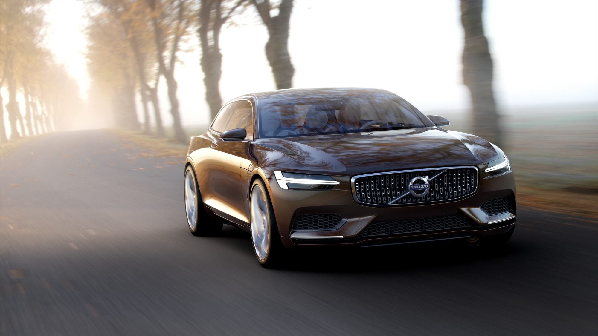
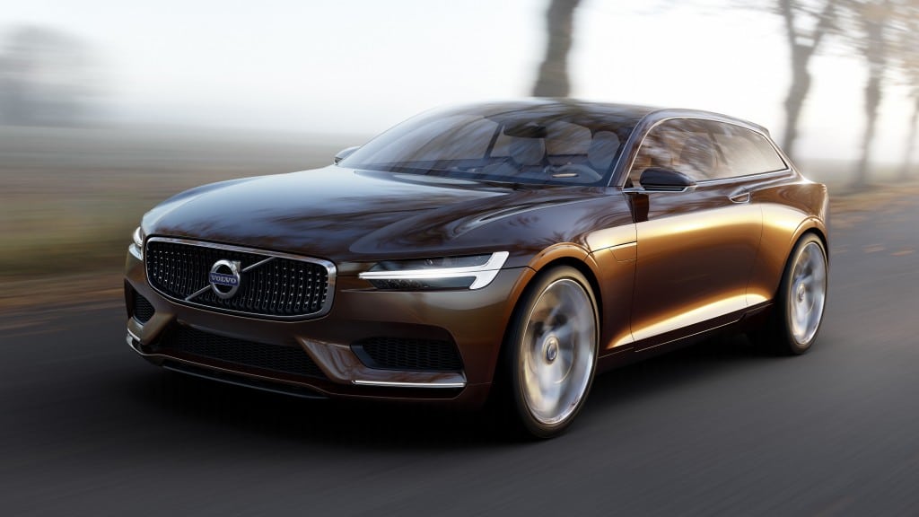
Volvo is unveiling the third in a series of concept cars it’s been rolling out at car shows globally this year. The Concept Estate carries the same exterior styling cues of the previous two unveils, but this time showcases Volvo’s plans for interior updates in its future model line.
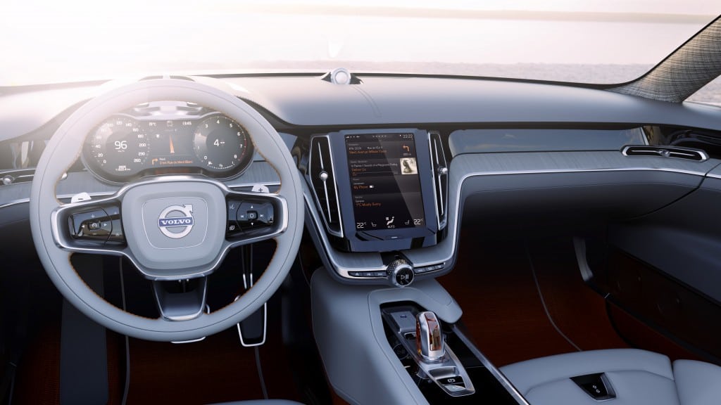
The interior in the new Volvo Concept Estate is simple, modern, and very sleek. The press release has more:
The Volvo Concept Estate’s most striking interior design feature is its simplicity. The traditional selection of buttons and controls have been replaced by one large tablet-like touch screen control panel in the centre console, bringing the interior firmly into the 21st century.
“The basic idea is to organise controls and information in a perfectly intuitive and user-friendly way. Everything is exactly where you expect it to be, making the drive more enjoyable, efficient and safe,” says Thomas Ingenlath, Senior Vice President Design at Volvo Car Group.
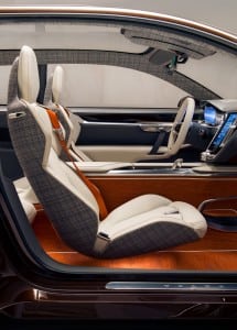 Note the large touch screen akin to that found in the Tesla Model S, though not quite as domineering as the Tesla’s is. That is key to Volvo’s new interior strategy of simplification.
“Not having to deal with buttons and controls for a growing number of functionalities is like being freed from a pair of handcuffs,” says Robin Page, Design Director Interior of Volvo Car Group. “This has made it possible to build a beautiful interior architecture around the portrait screen. The concept car showcases how this user interface will be integrated in our new car generation.”
We would agree with Ms. Page, having used the greatly simplified system offered in Chrysler’s Uconnect in the 300C.
For Volvo, this new Estate Concept could herald the eventual replacement for the luxurious V70 and XC70. The design language and philosophies shown in this year’s concepts will begin to appear in the model lineup starting with the XC90 SUV later this year.


