Automotive designers and many in the industry use jargon that many outside of that circle might find confusing. Sometimes, our job as automotive writers is to convert that jargon to phrases that explain them. Other times, though, we may not realize that a term we’re using is an industry “thing” and not well-understood outside of our clique. Here are five terms that are often used by designers and “car nerds” that anyone who wants to be conversant in the language of “car buff” should know followed by five more that are more design-specific.
Common Terms
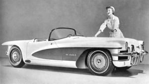 Most people are familiar with terms like “busy,” “land yacht” and “future reach” used to describe cars in general. “Busy” refers to how much is going on with a design overall, usually not in a good way. A land yacht, of course, is a big, boat of a car. We rarely see those today, but in the 1960s, ’70s and 1980s, they were commonplace. The “reach” of a car’s design describes how futuristic it is, much as that term is often used in other industries for the same or similar purpose. “Reach” can also be expanded to refer to consumer appeal “lots of consumer reach” in the marketing phase of design work.
Another common term is “greenhouse,” which refers to both the positioning and amount of glass a car employs in its windows as well as their potential effect on interior climate control and visibility. The rake (angle) of the windshield and rear glass often determine the amount of visibility and external heat transference (via the greenhouse effect) that a vehicle will have when sitting in a parking lot or driving on a sunny day.
Finally, “beltline” is a common term used to describe the line created by the door sills and lower window frames across the center of the car. It is often an integral part of the Theme Line (see below) for the vehicle.
Now, let’s get started with some automotive design terms you may not be familiar with. These are used often in the studio and in inner-circle conversations among car buffs and enthusiasts of design.
Coke Bottle
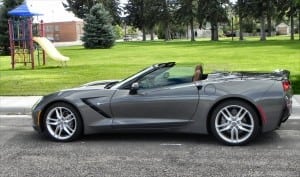 Many probably understand this term, or have at least heard it. Someone describing a shapely woman will likely say she has an “hourglass figure.” Similarly, a car with a womanly figure will have a “coke bottle” design. It’s an overall shape that pinches in the middle, creating a sexy front end and shapely rear quarter. Many vehicles have utilized this design and it’s a general shape that starts and accentuates most sports cars even today.
The term actually began with one of the most timeless classics ever built, the short-lived Studebaker Avanti. This is a car that, when it was introduced in 1963, showcased understated and beautiful design in such a way that the proportions of the Avanti are still used today in design schools to denote excellence in form. The Avanti had a slight bulge at its front fenders, a subtle dip to its beltline, and a pronounced rear quarter. Altogether, these created a “coke bottle” shape.
Squircle
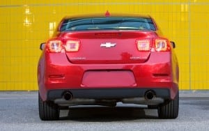 Combining the words “square” and “circle” (pronouncing them as “squir-sell”), this term refers to the squared circle. Unlike professional wrestling, however, the squared circle is reduced to squircle and used to note specific design elements that can appear singularly or throughout a vehicle’s look. These are circles that are square shaped and are most often seen on 1990s designs and some modern luxury designs.
Squicle use is seen subtly on many German vehicles, but is also often seen on Ford designs heavily influenced by former design lead J Mays. The squircle is beginning to see a sort of comeback thanks to its common use in computer-based user interfaces as icons for apps and websites. These modern elements, of course, bleed over into automotive design as automakers continually work to make their vehicles forward-looking and give them a younger reach.
Theme Line, Bone Line
The “theme line” is the overall shape (or impression of shape) a car gives. For designers, it’s often the bare beginnings of design and often, literally, begins with one or two lines. Some automotive marketing materials use the theme line for the vehicle as an impressionistic tool to showcase the exclusivity or beauty of the car. Infiniti does this often, for example, with its coupes and sedans (below photos).
Most theme line designs will convey a lot of information in just one or two pen strokes. If a car is to utilize a coke bottle theme, for example, the theme line will showcase that. Most of the time, the theme line will also convey the greenhouse’s shape from the side view, which is usually a big portion of the overall shape of the vehicle. Fenders will also prominently feature, as the tops of the front fenders are often the leading portion of the car and the shape of the rear fenders is what denotes the overall muscularity or sinew of the car itself.
On most vehicle designs, the finished product will utilize the theme line as its primary guide for the heaviest bulges and cuts along the fenders and belt line. Underneath and around those major design elements will be a bone line, used to subtly emphasize the shape conveyed by the theme line. These are elements that most people have to look for, as the bone line(s) are rarely obvious.
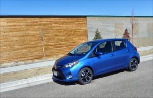 An example of these elements is with the Chevrolet Corvette. The new ‘Vette’s design is a classic and highly emphasized coke bottle whose theme line is very low, sinuous, and thickly muscular at the rear. Under that major line along the bodywork of the Corvette is a thin bone line that serves to emphasize the roof line above the belt, helping to tie the major elements of the car’s design together. Other vehicles, such as the 2015 Toyota Yaris, use a more pronounced bone line to accent the theme line itself.
Thick to Thin
This is a generalized term that conveys a description of the individual or overall form elements in a vehicle’s design that create or subtract visual weight. Taken as one piece, a vehicle’s design can be described as “heavy,” “light,” or with similar weighted terms. This is about eye candy or viewer appeal. Certain things in all design, whether it be a painting or a three dimensional object like a car, carry “weight” for the viewer. A photograph, for example, can weigh the subject by placing it at different locations within the overall picture and by utilizing the elements in the environment around the subject to draw the viewer towards or away from that point.
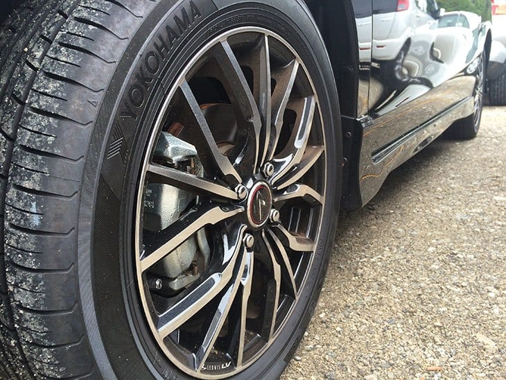
Similarly, a vehicle’s design can draw the onlooker’s eyes towards or away from portions of the car. The wheels, for example, can become a focal point or be de-emphasized by utilizing them to draw the eye towards an element nearby instead.
 The way a design is conducted and the individual elements within it will determine the thick to thin of the look. German vehicles, like BMW and Audi, tend towards minimizing this aspect of design, using it sparingly, usually as a way to further emphasize the theme line of the vehicle, which is considered primary in traditional Teutonic car design. Mercedes-Benz, on the other hand, bucks that tradition and instead does the opposite, often throwing several thick to thin elements (or thin to thick, if you’d like) to emphasize not only the overall “bow” shape most Mercedes vehicles have, but also to showcase individual elements of the car such as the wheel wells or rear haunches.
Most often, the thick to thin concept is used more subtly to keep surfaces and shapes looking dynamic and interesting. The most common use of thick to thin is to create a pattern of visual movement so that the vehicle looks like it’s moving even when parked. This is usually done by pushing visual emphasis towards the rear of the car, creating an “eye flow” that moves the viewer along the car towards its rear in a dynamic but unhurried way, which mentally builds an impression of forward movement.
Tumblehome
This may be the most obscure term on our list. Tumblehome is the term used to describe the angle of the passenger’s cabin versus the sides of the vehicle. In overall design, this angle determines the overall impression of stability the car gives to the onlooker, especially when seen from the front or rear. The tumblehome of a car, for example, can create emphasis or reduce emphasis on the width of the car’s body. Most vehicle design works towards implanting a sense of grounded stability, so the tumblehome will curve inward from the body at an angle meant to emphasize that point.
European sports cars, especially those of Italian make, are the easiest examples of tumblehome used at extremes. Many Italian sports cars, like Lamborghini, will have such steep tumblehome that the side windows literally cannot roll all the way down into the door. On the flip side of that coin, some vehicles such as the Land Rover Defender, have almost no tumblehome at all, putting emphasis on their height rather than their width.
Although the term “tumbler” for the Batmobile of the early 2000s may have come form its ability to bounce and tumble through terrain, it also could have been a reference to its extreme tumblehome for the small cockpit portion. In cases of extreme tumblehome like that, the design makes the passenger area look very small in relation to the rest of the vehicle, which gives the visual appearance of muscularity, speed, and performance handling. When little or no tumblehome is used, as with a minivan or a large sport utility, the emphasis is the opposite, creating the impression of massive interior space and roominess.
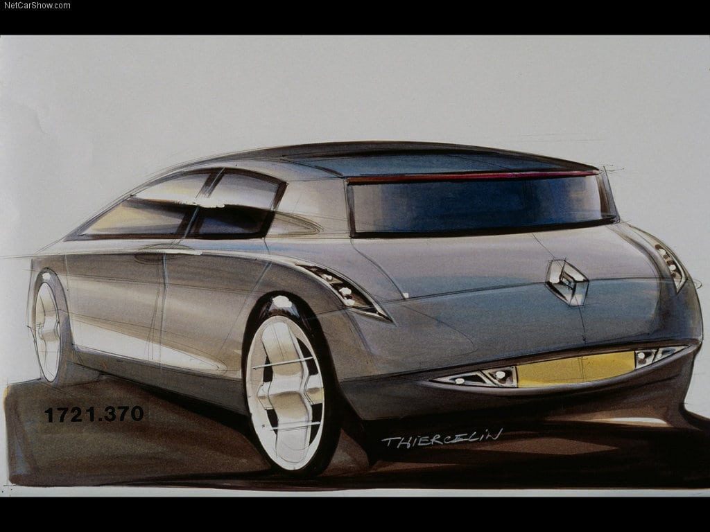
Cover photo of a 1998 Renault Vel Satis, which we featured in a Coffee and a Concept two years ago.


