We recently drove both the 2013 and the 2014 Toyota Tundra pickup trucks in week-long tests as everyday vehicles and trucks. The differences between the two model years, with the redesign for 2014, are sometimes striking and sometimes subtle. They are polarizing enough that some enthusiasts, like our own Tim Esterdahl, will purchase one over the other as a favorite.
Before we publish our complete reviews of the 2014 models (we drove both the Tundra Limited and the Tundra 1794 Edition), let’s look at what changed from model year 2013 to 2014.
Things that didn’t change in the 2013-2014 Tundra
Let’s start with the things that haven’t changed. The powertrain and all that goes with it are still the same. So is the basic offroad option with TRD. Same with the plastic bed liner, tire and wheel sizes, and other components of the basic pickup. All are unchanged.
The base engine is a 4.0-liter V6 offering 270 horsepower. It’s available in two-wheel drive trucks only. It’s capable of propelling the Tundra down the road, but not much else. The mid-level engine is a 4.6-liter V8 that outputs 310 horsepower and offers decent towing and hauling capability in both 2WD and four-wheel drive applications. Finally, the top-level 5.7-liter V8 offers 381 horsepower and a huge amount of towing and hauling as well as a lot of brute force when powering through offroad scenarios.
Fuel economy drop?!
Fuel economy for the V6 and 5.7L V8 hasn’t changed, it’s still abysmal. In the mid-level V8, however, it actually drops by a point on both combined and highway mileage, depending on whether you choose 2WD or 4WD.
In the 2WD 4.6L V8 option, combined EPA MPG drops from 17 to 16 mpg for the 2014 model year. In the 4WD model of the same V8, the EPA drops the highway MPG for the 2014 Tundra from 19 to 18.
This isn’t much of a change, taken on its own, but when considering that all of the competitive trucks on the market have improved fuel economy to points well beyond the Tundra in recent years, it’s a little more telling.
Exterior changes in the Toyota Tundra
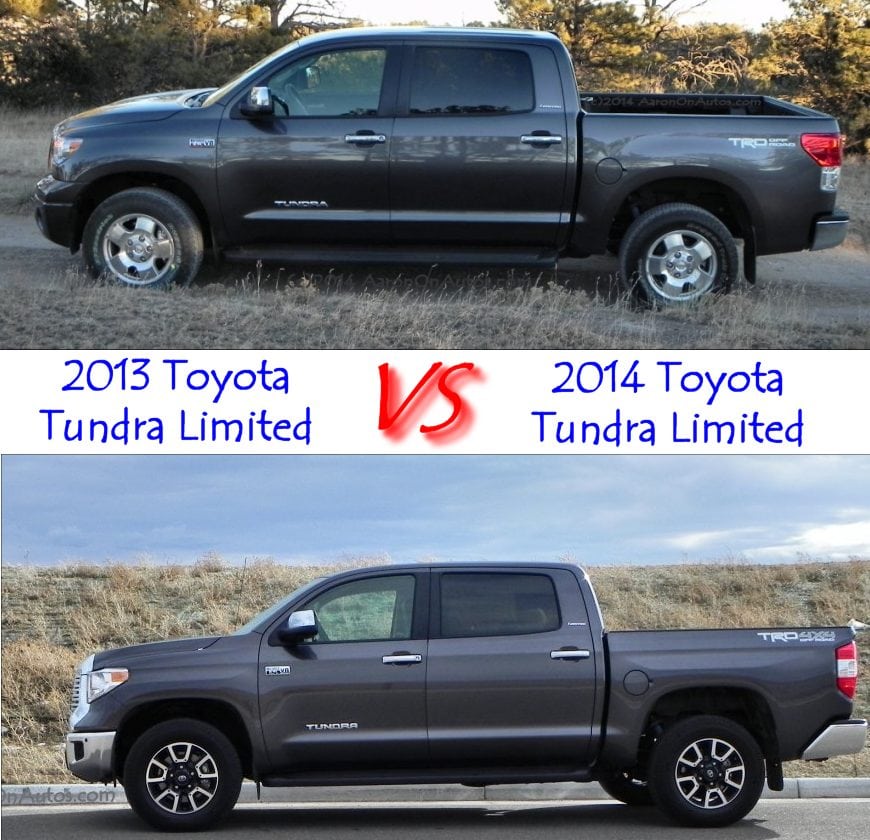
 Sitting side-by-side, the 2013 Tundra versus its new 2014 replacement is a very different truck. Style, of course, is a matter of personal preference, but the 2013 Toyota Tundra looks like a child’s toy compared to the more robust and beefy 2014 Tundra at right.
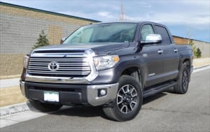
The most striking difference is the grille, which goes from a wide-banded plastic contraption (on all but upper trims of 2013 models, shown below) to a big, shiny, aggressive chrome-edged and slatted maw. This, along with the three-piece bumper below it, dominate the front of the Tundra to set the tone for the overall new look of the truck.
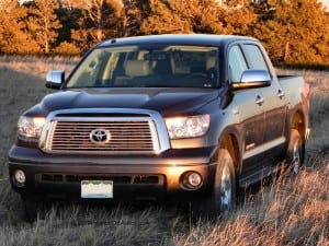 To either side of that are more peering headlamps, tapering back into the fenders. The signature coupe-like Tundra roofline remains, but the edges of the bodywork are more squared off than they were before, and fender flares, especially on the rear axle, are slightly more accentuated for muscularity.
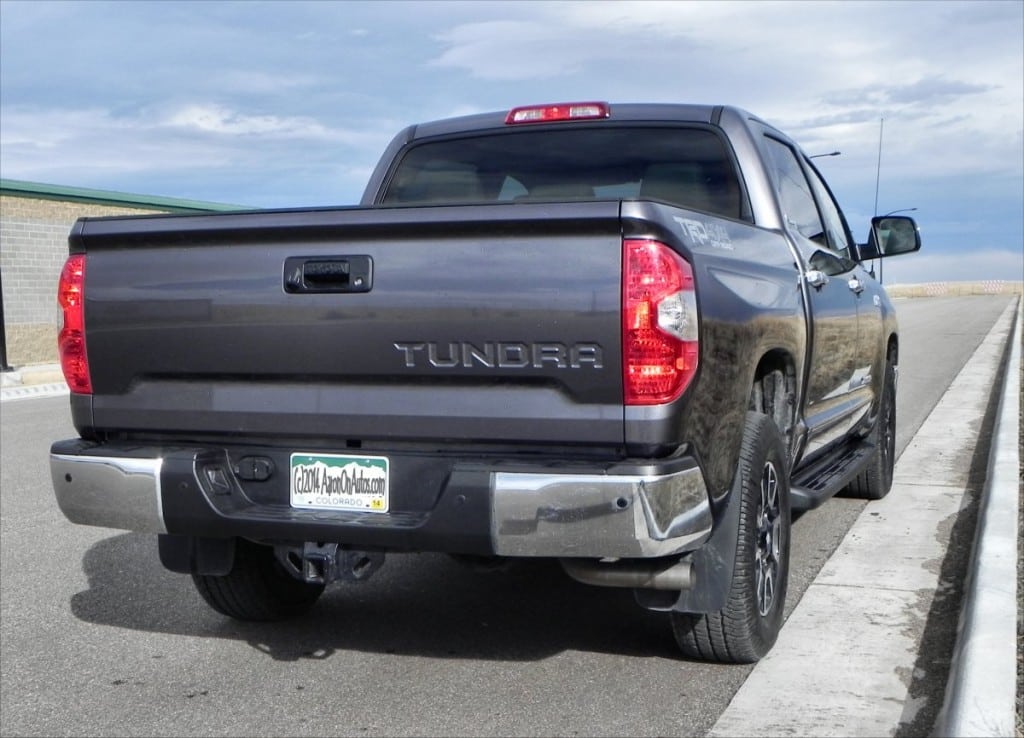
At the back of the truck, the tail has sharper edges and the Tundra title is stamped into the tailgate rather than painted on as with the 2013.
Overall, exterior changes are to give the 2014 Tundra a beefier and more grown up look over its 2013 predecessor.
Interior differences in the Tundra
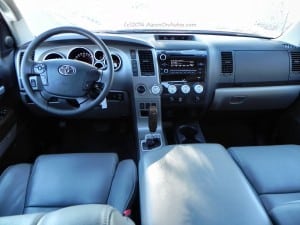 Lots of things change inside the truck, most for the better. The instrument cluster is shallower and has better color contrasting for easier readability. The shallow set means that it receives more glare from the sun at certain times of day, but the easier-to-read gauges are an improvement overall. For the driver, the steering wheel is slightly larger and more open, making it easier to grip and turn (2013 shown at left).
To the right, at the center stack, the entire console is pulled forward about two inches. This greatly reduces the Orangutan-arm reach requirement the stereo and other controls had before. Vents are all round, very adjustable Euro-style ports as well, making them a lot more useful in directing airflow.
The dashboard is slightly more airy, with a bit more space showing underneath the passenger’s side, but retaining the wide, flat upper surface many truck owners prefer. The shifter, drink holders, and other details are largely the same from 2013 to 2014; and although Toyota added Entune updates to the infotainment system for the upper packages, it’s still the same clunky interface as before.
 Seating up front is slightly different, but still has the same wide-bodied comfort that the Tundra has always sported. The center console storage changed in look, but is still cavernous and makes for a great armrest as well.
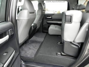
The back bench sees a lot of change. The slide-and-recline feature is gone in lieu of the bench bottoms lifting (at right) to access some kind of odd under-seat storage idea that never comes to fruition because the cushions are too thick to allow anything but thin items to be stored. Meanwhile, the installation of child safety seats with top tethers is greatly complicated now that the seats do not tilt forward for easier access to the anchor points. Removing the wonderful, class-exclusive slide-and-recline of the 2013 Tundra in the 2014 model also greatly reduces comfort for the back seat passengers, even in the huge CrewMax as we drove it.
Finally, many will note the lack of a grab handle on the driver’s side of the 2014 Tundra. This changes dynamics for those not large enough to just slide into the new truck.
On and Off the road in the 2013 vs 2014 Toyota Tundra
Little has changed in the Tundra’s on and off road feel from 2013 to 2014. Despite some suspension and chassis tweaks from one to the next, the 2014 Tundra is not markedly improved in ride comfort. It retains the rough, unforgiving highway presence it had before but also keeps the solid offroad feel in the TRD package.
Of all the pickup trucks on the market in the full-size arena, the Tundra alone still retains its “big boat” feel and battleship parking requirements. To counter that, though, steering in the 2014 Tundra is a bit easier on the arms than it was the year before.
Conclusions
In all, the 2014 Tundra (above) saw a lot of changes from its 2013 Tundra predecessor. We really like the bigger, beefier look and stronger presence as well as the ergonomic improvements given to the interior. We’re also wondering why Toyota didn’t take the opportunity to improve fuel economy and ride as well.


